


GUI Olympics 2004: Best overall visual style results!
| Skin/Author | Screenshot | Comments | |
|
|
Antares treetog |
 |
This is a visual style where the screenshot tells you almost nothing about it. Someone looking at the screenshot may not recognize how awesome this skin really is. It's all in the details. The actual use of it. Antares is a reminder of why most people bother to change the look and feel of Windows in the first place. Its animations, sounds, toolbar icons and progress animations go together. One cannot help but appreciate the immense time and effort spent on this along with an attention to detail that most people will never recognize. It is for these reasons, and more, that the judges concluded that this was the best visual style of the GUI Olympics. |
|
|
Pixel 8 essorant |
 |
This is another visual style where the screenshot doesn't really do it
justice. One might even say it's kind of odd looking. But it's when you
use it that you really appreciate it's design. It's not just different
looking from the regular Windows design, it's more usable. It's hard to
go back to a plain Windows system after running Pixel 8 for awhile. The
perfectly spaced title bar buttons make it a pleasure to use for long
periods of time.
It is also very complete. What probably gave it those last extra points was that it alone of the finalists included a good dialog background texture which helps complete the overall effect. |
|
|
Vector-Cell b0se |
 |
Vector Cell was the favorite of many of the judges in many many areas.
It is a clean skin with a very unique design. If the judges were voting
on "Coolest looking skin you're most likely to recommend to your friends
who are only casually into skinning" this would be the skin.
It doesn't include toolbar icons or progress animations which all the other finalists included. This made judging it difficult because if completeness is a factor, then one must decide how much those factors should matter. On the other hand, it included the best wallpaper of any of the finalists. WindowBlinds allows wallpapers to be integrated into part of the skin and we felt that this helped give it a complete look that casual users are more likely to appreciate. Vector Cell's unique design, high usability and overall excellence helped propel it to be in the top 3 best visual styles of the GUI Olympics in a field of over 100 skins. |
| 4th |
neOS danilloOc |
 |
NeOS had some of the best sound effects of any skin. When you press the
title bar buttons, cool effects are played which gives this skin a nice
feel.
NeOS would be a good representative of one of the primary philosophies behind using skins -- making Windows look cool and different. At the same time, as more casual users have gotten into skinning, it would also be representative of the kind of skin many non-WindowBlinds users don't like. Thick title bars and busy title bars. Fortunately for us, this is about WindowBlinds visual styles and WindowBlinds users and the general principle is "Why am I changing the look of my GUI in the first place?" It has sounds. It has a roll-up button, and it is very complete. Which is why it has won one of the top honors of the 2004 GUI Olympics. |
| 4th |
G-Pod Gabriel |
 |
G-pod was one of the most unique skins and like others, screenshots
don't do it justice. Fully animated with a heavy use of sound and
probably the best progress animation in the contest, G-Pod has it all
going for it. Like neOS, it's also probably one of those skins that
casual users would say "It's too big and chunky" (a response that tends
to make some of us want to say "Save up your allowance and buy a 17 inch
monitor and go up to 1280x1024 where you can really appreciate these
things).
The one downside of this skin, which is easily correctable, is that it has a minimize to system tray button where one would resize a skin. You can load it up in SkinStudio and disable the button very easily. It's innovative design and just overall coolness made us choose it as one of the best skins of 2004. |
| 5th |
Quasar MikeB314 |
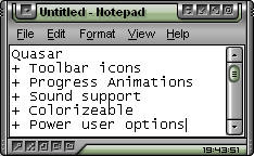 |
Quasar was a favorite of many users based on what we saw and it was a
favorite of the judges as well. It has a very elegant design with some
excellent power user features (see the bottom border). It also packs all
this into a relatively small space which makes it not be particularly
large.
MikeB is pretty well known in the skinning community as one of the skinners who can make the most of a few more pixels in window borders. Most borders of a window are just wasted space. But MikeB's skins tend to make the most of those few extra pixels WindowBlinds allows him to make use of. |
| 5th |
Blanco The Morphium |
 |
Blanco was also a heavy favorite in the skins this year. Its clean
design and high usability made it a natural skin to use. It was also
reasonably unique in its overall concept and well executed.
Morphium has emerged as one of the up and coming skinners in the skinning community. He has a knack for understanding the types of skins people use. Being the best overall visual style isn't necessarily about what skin most people would want to use (otherwise Erik Holmer's excellent Luna HOE, a favorite daily use skin amongst the judges would have won). But Blanco wasn't just complete, it was a unique skin in many ways. Usable and unique is not easy to accomplish these days but he did it. Which is why, Morphium's Blanco walked away with one of the top honors. |


 Congrats again to all the medalists - this competition will be tough to top!

 Oh well, I can't argue with the decision, the winners definatly deserve it. Congratz to all.