


Ship Break down, Comparing old and new
The new designs have pro's and cons, but what are some of our expectations for final release?
Some people have already commented on the new ship designs and that feedback is super valid. I think its prudent we should provide our feedback to the devs so they can get a better idea of what we would like to see. It also helps them manage those expectations by address or clamping down on ideas that get to far away.
I want to compare the new and old directly to each other so we can break down what these changes are. What we think works and doesn't work, and provide the team some feedback.
I try to be as constructive in mine as I can and I don't want to imply the art and models are badly made, they doe seem to be very way made and design. I do think there was a departure from ship design philosophy of the TEC though, and some bits of the ship do seem like they were not handled without the same love or passion as the older games. My primary focus will be to focus are where I think improvements can be made.
Im also interested in getting as much feedback as possible out there so comment on what you think works and doesn't work as well.
So for the the elephant in the room, the Kol class has seen some changes: (Link to full size)
 (Link to full size)
Color, Contrast, and Brightness
The color instantly changes the theme of the game. This is something that can't be unseen and avoided. The choice for sins 2 to be more vibrant and colorful is noticeable and feels as it is impacting the themes of war and strife previous games had. It also seems to downplay the threat chasing the vasari. How bad can that threat really be if the universe is this...vibrant.
This visual choice suggest the the TEC in 2 seems to be considerably better off. It looks as though they are not war torn any more. The new Kol looks almost luxury now. Like the TEC is so well off they can focus on making things look nice. My expectations based on the lore is that ships would look and feel like they are repurposed older ships. They are ships that have seen battle.
I understand in multiplayer we want clear textures that indicate ship teams. It Rebellion there was a toggle to make ships display paints more prominently. I would hope to see something similar, that way we could toggle off the paints and show more of the metal.
Now, if that paint comes off in battle, that's a different story. As the ship levels if the texture changes, then that would make having more paint on it to start considerably cooler. It would be a case of rule of cool beats out.
Barring that I'd say, many of the fans would probably be more in favor of the worn torn and gritty look of old kol.
Similarly something about the contrast, and brightness of the new design screams...cuddly? And maybe someone has a better word for it but that new Kol seems very soft in comparison to the old Kol. In a lot of ways it kinda even seems like there was an attempt to copy the paint style of ships from Homeworld. Especially that blue paint design which looks almost exactly the same as the ships being used to market Homeworld 3. They use a nearly identical blue and white and similar pattern.
Ship design philosophy and Diversity
Things are sleeker and turrets are bigger (probably because turret combat so an overhaul that required them to be bigger). These seems like a departure from TEC design philosophy compared to the older games. Which is strange because the advent are very sleek and the new Kol looks like it would fit better with the rebellion advent faction as a result.
There is less greebling. We don't see as much in the way of trenches, panels, antenna, windows and just in general small details.
The sweeping forward pillars or pylons in the front of the new Kol suggest that instead of the 4 laser like weapon effects the Kol had in rebellion has been changed and the new one will shoot 1 big beam. I wont speak to which way is better or not, but by sweeping forward and towards a center point, the design does contribute to making the ship feel less TEC and more Advent or Vasari.
The back half of the new Kol does look better, in my opinion than the original. It has that extra turret hard point on top with a more sturdy back spine. The engines seem protected and covered by armor instead integrated as part of the armor which is cool. The adaptive shield generator seems a bit more simple, but I like the general shape of things.
I know scale is hard to tell, but does anyone else feel as though the new Kol looks smaller? This may be because the turret scaling, but the ship in general seems smaller to me.
Lastly, where the hanger? This one I'm willing to give ground on on one condition, the Kol doesn't get its first fighter until its leveled up a bit. If the model changes to include a hanger later on then that is awesome. If not then send this one back and get a hanger on it asap. The Kol looks dinky without it. Honestly it feels weaker.
This ship: (can't tell exactly which ship it is suppose to be) (Link to full size)
Im not saying what its, but here's an Advent scout from Rebellion. 
Same bottom fin, and similar silhouette.
Here's what I will say, IF this ship is in fact the Advent Seeker, then Bravo. It looks fantastic. In almost every way. It's got a few sharp edges to it which honestly would need to be softened down a bit to make it feel more advent, but everything else works really well...that is...if it truly is an advent ship.
My concerns is all other pictures have been TEC and this is not a TEC ship.
We see it in the fleet in the picture with the Kodiak's. If it is a TEC ship then I'm at a loss, because it really stands out and goes against the general design of TEC ships. It really should not be in a TEC fleet.
I will say though, I don't think its the Cobalt. You eagle eyed folks out there may have seen the full bomber picture and, the Cobalt might be hiding in that picture.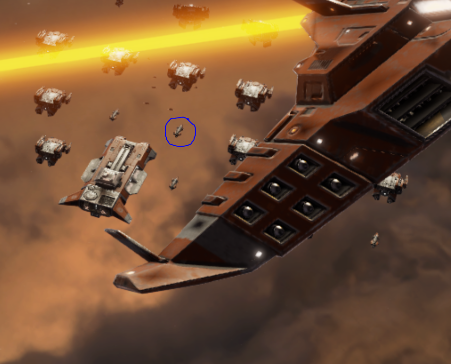 (Link to full size)
That is the silhouette of a cobalt right there, you can't change my mind on that. I mean look at it, that's a cobalt right there.
What do you think that the ship above is though?
Akkan: (Link to full size)
 (Link to full size)
As my personal favorite ship, this one is a huge deal for me.
Color, Contrast, and Brightness
The coloring on this ship straight up makes it look like a cruise ship. Im not sure what we are going for here but the change is very noticeable. While I'm not as bother with the paint as much for the Akkan compared to the Kol The feel of the ships is very different. This ship seems less combat capable. Something about the paint just gives it this soft look.
Ship design philosophy and Diversity
I love that bit in the back right side of the new one that looks like a landing pad for small ships. It is a nice bit of detail but it seems like some much time was spent on that one section you forgot to do the rest of the ship. In Rebellion the Akkan had so much more. The hull was not sleek, it had bit jutting out, it had windows on every deck, it had multiple towers, and guns that seem almost like broad side cannons.
Wheres that detail on this new model? the new one looks a lot less paneled, and just more smooth. The front right side looks so much less interesting.
The new Ion cannon does look cool but the front end of the new design is so much less interesting over all. its Too symmetrical. The old one had an large armor looking overhand covering the forward gun looking bit. The lower end where the new ion cannon is was angular but rounded which made it look almost industrial. Like the ship felt like there was a lot inside of it. Given it colonizes that makes sense.
Another 2 hangars lost. Honestly it feels like a lot of love is missing for hangers in sins 2.
The Akkan has 2 hangers, one on the side one on the front. They contribute so much to the design and they are just gone. Without them the ship just looks wrong. The new design seems less capable, less modular and over all less useful.
Again though, doesn't the ship seem smaller? Like the scale may be different or may be the same, but it looks like its smaller.
Kodiak (Link to full size)
Look how they massacred my boy.
The TEC has a Kodiak heavy cruiser and buddy, this ain't it. Get rid of this thing. it doesn't belong anywhere. It was a mistake.
This is the right kind of Kodiak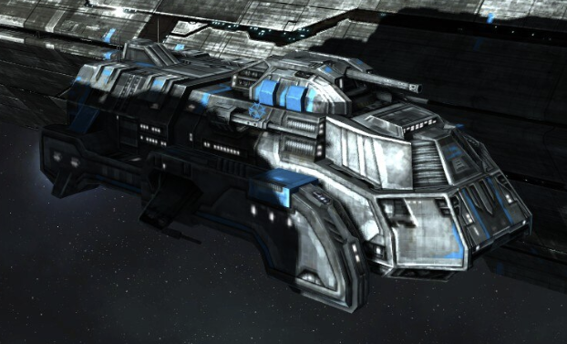
This thing looks mean, it looks dangerous. It is an actual tank in space. The new one looks like Thunderbrid 2 having an identity crisis. The new oneis fat and looks more like the UD-4 drop ship from Alien.
Please send that one back for a another pass.
Percheron Light Carrier, Strike Craft and Bombers: (Link to full size)
 (Link to full size)


The fighters are very skinny. like very very skinny. They looks weak, small and generally not all that intimidating. I feel like the fuselage needs to be widened a bit. Or maybe just the cock pit needs to be replace. Get rid of the bubble canopy and go with a more angular one.
The bomber seems meaner. Which honestly is a surprise given all the other ships look weaker. Its more angular, and actually feels bigger. Like it might have a crew of three or four where as Rebellions bomber looks like its a one, maybe two pilot ship.
The b2 bomber look of the original is cool, and the engines are pretty nice, but the huge amount of wing mounted torpedo/missile launchers on the wings of the new oe honestly look like an intimidating sight. IT honestly resolves a gripe about older sins bombers because bombs to drop in space, missiles do make more sense.
That said those vents need to go. Why? What are they there for? the wings are angular and have no airfoil so this is obviously not an atmospheric craft. Those vents are out of place.
Lastly the Percheron honestly looks like an all around upgrade. I like the wings, I like the hangers being to separate side by side hangers in stead of 1 big one. the bridge/Traffic control of the ship is more pronounced and looks better. The spine down the front has more greebling and detail, and the back top of the new design is asymmetrical and looks like it has more equipment on it.
The new light carrier is a thumbs up from me, that was a good design choice all around I think.
Bonus: This station:


After looking at this trade station in the opening video every time I launch vanilla rebellion, I am convinced the trade station is a station they are not allow to alter. Sorry devs, but you ingrained it into our heads. You reinforced it. Thats the deal.
That said that station in their planet image is very plain. Its hard to tell what it is suppose to replace.
The civic and Military trade stations from rebellion are both better than it in terms of detail and all around design. I get they have been combined in sins 2 but, if that station is the new research station...it needs a ring, several arms added to it, and more antennas.
